Components
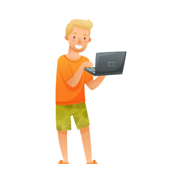
#Avatar
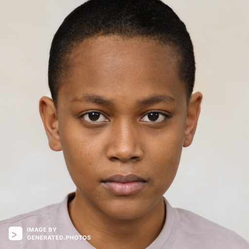
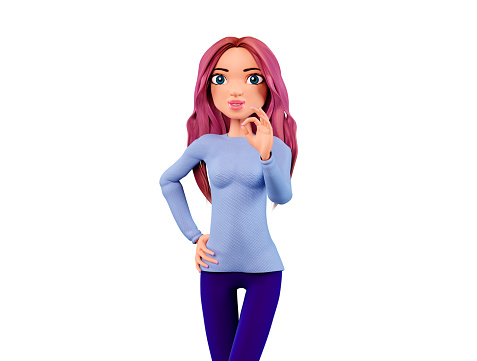
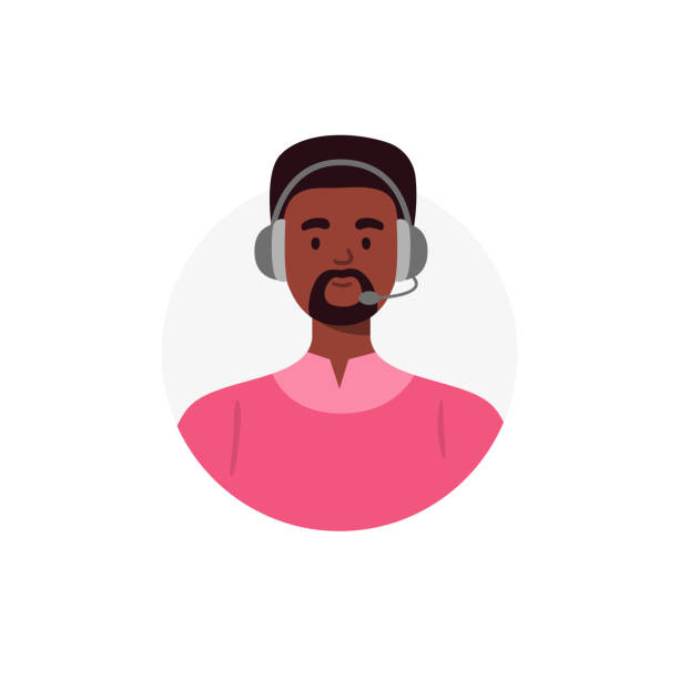
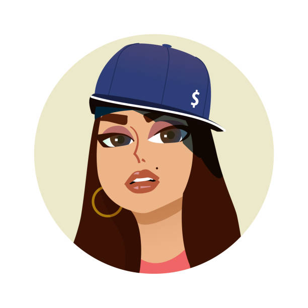
An avatar is a graphical representation of a user or the user's character or persona.
We have illustrated 5 different sizes of Avatars.
`avatar-xs-small` represent smallest avatar, whereas
`avatar-xl-xlarge` represents largest one.
`avatar-l-large` , `avatar-s-small`
and `avatar-r-regular` are in between above two.
Copy below code to create your own avatar.
Profile Avatar may show some Alphabet when profile pic is not available. It generally represents intial letter of account holder's name.
Copy below code to to get your own alphabet avatar.
#Alert
Alert box displays to an User a dialog box with optional message.
copy and paste below code to get your own alert box
#Badge
Badge is a counter or some kind of status indicator shown on avatars, icons and much more.
Badge on Avatar
copy and paste below code to get badge on Avatar
Badge on icon
copy and paste below code to get badge on icon
#Button
Button is a clickable component on the Ui which is often used to perform some operations when pressed.
CTA- Call to Action Button
copy and paste below code to get your own CTA button.
A Basic Button
copy and paste below code to get your own basic button.
Link Button
copy and paste below code to get your Link button.
Social Media Button
copy and paste below code to get your own social media button.
Icons as Button
copy and paste below code to get your own basic button.
Floating Action Button
Floating Action button is generally a circular button present on top of screen which is used to perfom primary or most common operations. Here It is left aligned. When clicked Page will scroll to top.
copy and paste below code to get your own basic button.
#Card
Cards is small Rectangular component of web-page. It comprises of images, links, text, button etc.
Cards with Badges
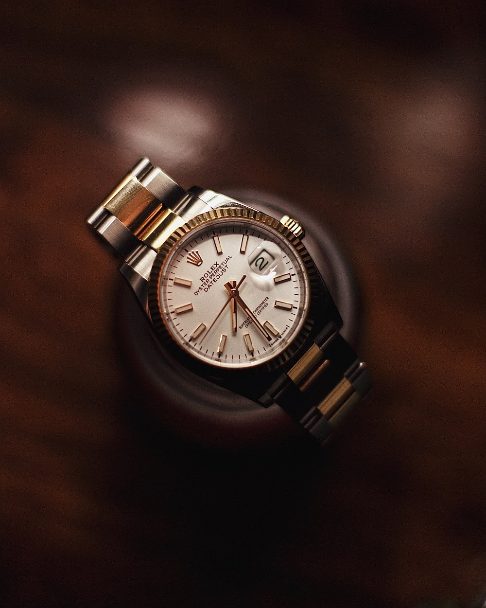
ROLEX WATCH
OG of all watch is here. Talk about luxury or fashion quotient, It always tops the chart.
$1800 $2000 (20% off)
Copy and paste below code to get text with basic badge
Cards with Dismiss
ROLEX WATCH
OG of all watch is here. Talk about luxury or fashion quotient, It always tops the chart.
$1800 $2000 (20% off)
Copy and paste below code to get text with dismiss button
Cards with text overlay
ROLEX WATCH
OG of all watch is here. Talk about luxury or fashion quotient, It always tops the chart.
$1800 $2000 (20% off)
Copy and paste below code to get text overlay card
Text only card
ROLEX WATCH
OG of all watch is here. Talk about luxury or fashion quotient, It always tops the chart.
$1800 $2000 (20% off)
Copy and paste below code to get text only card
Horizontal Card
ROLEX WATCH
OG of all watch is here. Talk about luxury or fashion quotient, It always tops the chart.
$1800 $2000 (20% off)
Copy and paste below code to get horizontal card
Card with shadow
ROLEX WATCH
OG of all watch is here. Talk about luxury or fashion quotient, It always tops the chart.
$1800 $2000 (20% off)
Copy and paste below code to get card with shadow
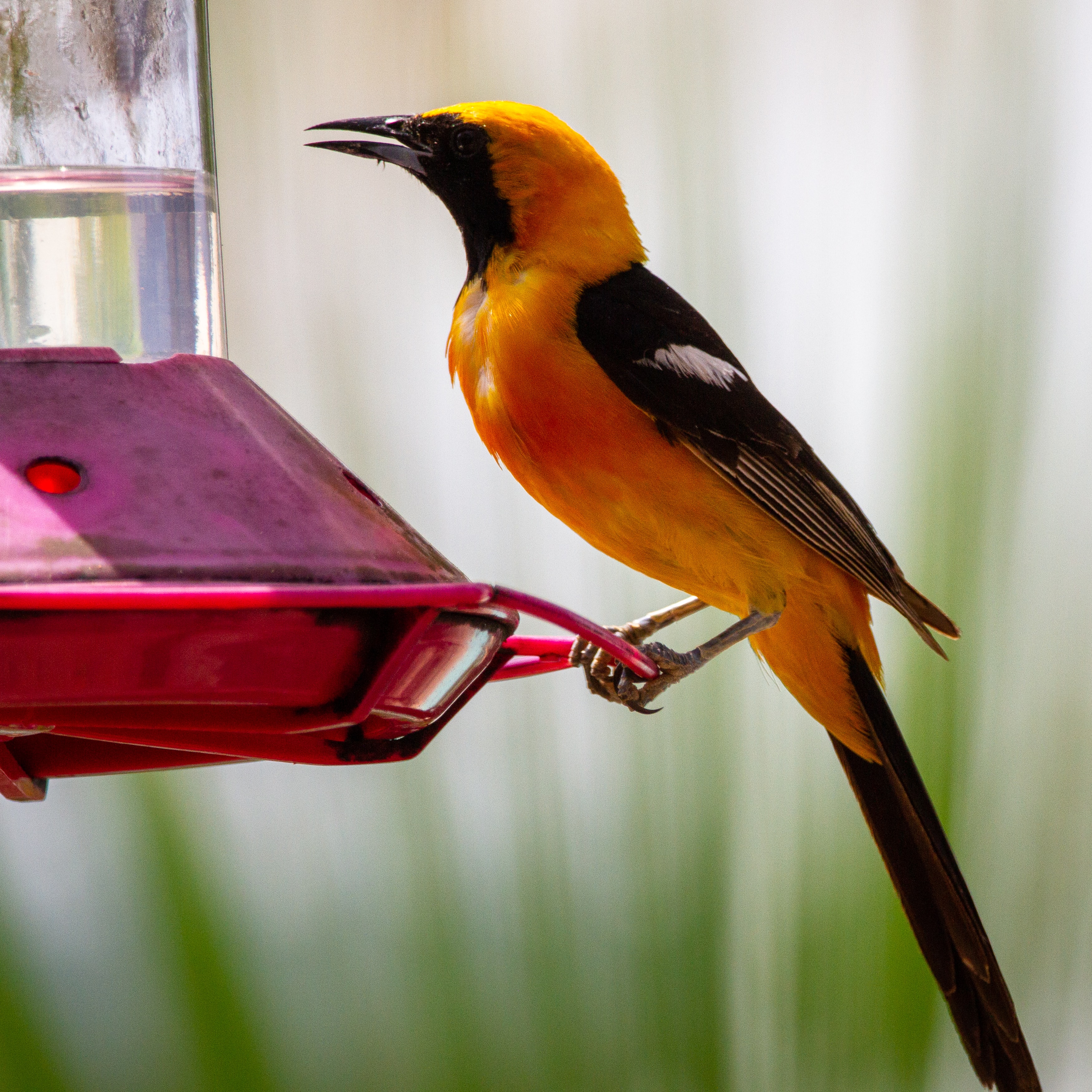
#Image
Image is an artifact that depicts visual perception and resembles a phusical object and thus also provides its depiction. Eg. Photograph
Responsive Image
Responsive Images are images which fits all devices perfectly. Be it mobile-devices or desktop.

Copy and paste below code to get responsive image.
Rounded Image
Image having round shape.
Copy and paste below code to get rounded image.
#Input
Input element is used to interact with users in order to get data from them.
Input text
Input text is used to take input from users in form of text.
Copy and paste below code to get input textbox
Input with validation and errors style
Input text also provides error or success depending on whether user met required condition
Copy and paste below code to get input with validation and errors style
#Text-utilities
Text utillities are different form of texts used in a web-app which provides multiple sizes and styles.
Heading
Heading is used at top of web-site to give Brand's name or websites.
Copy and paste below code to give good Headings.
small Text
Small text is used to give not so important information. It may also used to give additional infos.
Copy and paste below code to give small size text.
gray Text
Gray text is used to give gray colors to text present in website.
Copy and paste below code to give gray color text.
center Text
Center text is used to position text present in layout to center of layout.
Copy and paste below code to give centered text.
#List
List is used to arrange items in different sequences.
unordered list
unordered list are the sequence of items which has no particular order. It is preceded by bullet.
- Item1
- Item2
- Item3
- Item4
- Item5
Copy and paste below code to get unordered list.
Numbered list
Numbered list are the sequence of items in increasing order. It is preceded by numerals.
- Item1
- Item2
- Item3
- Item4
- Item5
Copy and paste below code to get numbered list.
Alphabetical list
Alphabetical list are the sequence of items in increasing order. It is preceded by alphabets.
- Item1
- Item2
- Item3
- Item4
- Item5
Copy and paste below code to get alphabetical list.
spaced list
Spaced list are used to display collective piece of item in form of list separated from each other.
-
Accounts
Privacy, security,change number
-
Chats
Theme,wallpapers, chat history
-
Notifications
Message,group & call tones
-
Storage and data
Network usage,auto-download
-
Help
Help centre,contact us,privacy policy
Copy and paste below code to get spaced list items.
stacked list
Stacked list are used to display collective piece of item in form of list layered one onto other.
-
Accounts
Privacy, security,change number
-
Chats
Theme,wallpapers, chat history
-
Notifications
Message,group & call tones
-
Storage and data
Network usage,auto-download
-
Help
Help centre,contact us,privacy policy
Copy and paste below code to get stacked list items.